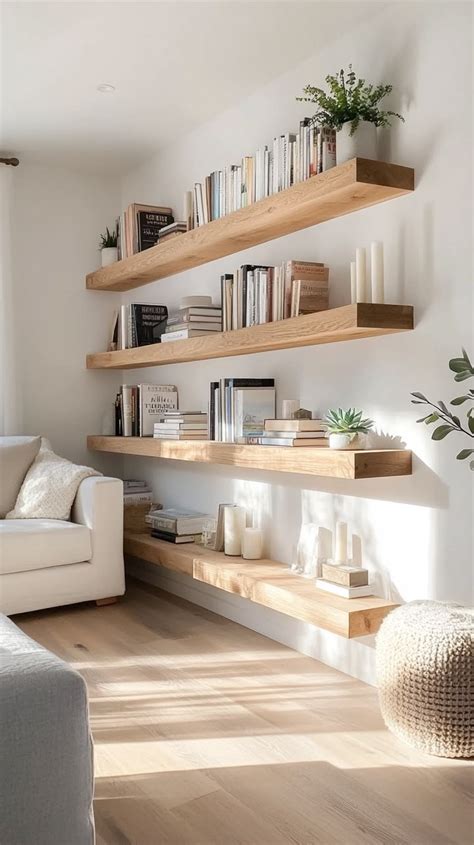
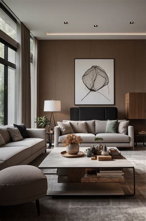
When designing a living space that feels both personal and thoughtfully curated, introducing high-impact statement pieces is a proven way to break away from monotonous design. Incorporating zebra print elements alongside traditional wood furniture offers an unexpected contrast that bridges wild, graphic energy with organic warmth. This pairing might seem daring at first glance, but when grounded by proper interior design principles, it creates a sophisticated atmosphere that feels neither chaotic nor outdated.
For homeowners and apartment renters across the United States looking to refresh their primary gathering spaces, mastering this combination requires a delicate balance of scale, texture, and color theory. By treating bold patterned upholstery as a focal point and using surrounding wood finishes to anchor the room, you can achieve a cohesive aesthetic that honors both modern eclecticism and timeless comfort.
The Psychology of Contrast: Balancing Zebra Print with Wood Tones
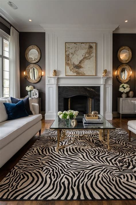
Zebra print is inherently dynamic, featuring a high-contrast linear motif that instantly draws the eye. To prevent this pattern from overwhelming a room, it must be balanced with materials that offer visual weight and tactile serenity. Natural wood furniture—whether featuring rich mahogany, warm honey oak, or sleek walnut finishes—provides the necessary grounding effect to keep the space feeling grounded and livable.
When selecting accompanying wooden elements, consider the undertones of the wood in relation to the crisp black-and-white or creamy beige tones of the print. Medium-to-dark wood tones often create a dramatic, moody library feel, while lighter Scandinavian-inspired woods introduce an airy, contemporary contrast. The key is avoiding overly glossy finishes that might clash with the organic movement of the zebra pattern, opting instead for matte or satin varnishes that diffuse ambient light.
Choosing the Right Wood Finishes for Your Statement Pieces
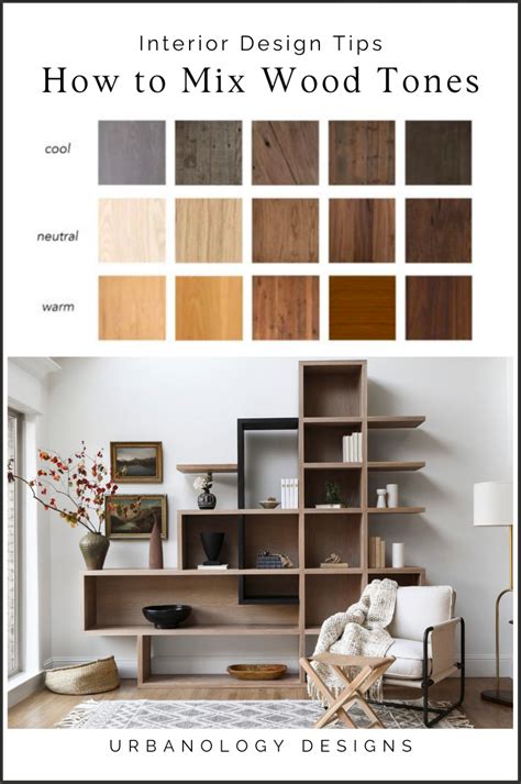
The success of mixing animal prints with timber largely depends on grain visibility and color temperature. Warm woods with pronounced grain patterns, such as teak or rustic oak, add an earthy layer that softens the stark geometry of striped upholstery. If your statement piece features carved wooden legs or a visible wooden frame paired with zebra cushions, let that built-in harmony dictate the rest of your case goods.
Avoid matching every single wooden item in the room. A curated space relies on a mix of finishes rather than a matching suite. Pair a zebra print armchair with a weathered oak coffee table and a minimalist walnut media console. This layered approach introduces depth and prevents the room from looking like a showroom floor, creating instead an authentic, lived-in environment.
Strategic Room Layouts for High-Impact Furniture
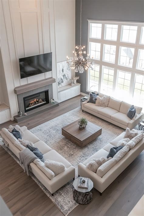
Positioning bold furniture requires careful spatial planning to ensure the room remains functional and visually balanced. Because zebra print commands immediate attention, it should act as the visual anchor of the space. Placing a statement sofa or accent chair directly opposite a neutral viewing wall allows the pattern to shine without competing with other heavy visual elements in the room.
In standard suburban American living rooms or more compact urban apartments, traffic flow is paramount. Ensure there is ample clearance around patterned pieces so they do not feel crammed into a corner. By floating your statement furniture away from the walls and arranging softer, solid-colored seating around it, you establish a conversational zone that feels intentional, welcoming, and easy to navigate daily.
Anchor Your Layout with Neutral Textures
To let your statement furniture stand out, surround it with neutral, tactile surfaces that offer a break from the pattern. A large, low-pile wool rug in an oatmeal or soft gray hue can define the seating area while subduing the floor plane. Layering these neutral textiles prevents the room from feeling visually heavy, ensuring that the eye can rest between focal points.
Window treatments and lighting also play a critical role in layout success. Keep drapery light and translucent to maximize natural daylight, which brings out the subtle warmth of the surrounding wood tones. Position floor lamps or table lamps to cast warm pools of light near your statement pieces, highlighting both the rich wood grain and the sharp graphic lines of the print after sunset.
Color Palettes That Complement Zebra and Wood Decor
Working with a black-and-white pattern paired with natural wood opens up versatile color palette opportunities. While a monochromatic scheme of creams, grays, and blacks feels effortlessly chic and modern, introducing subtle color accents can completely transform the mood of the room. Earthy tones such as muted olive green, terracotta, and warm rust work exceptionally well alongside wood and animal prints.
If you prefer a more luxurious, moody atmosphere, consider deep jewel tones like emerald green or midnight blue for accent walls or decorative pillows. These rich colors complement the organic warmth of wood furniture while providing a sophisticated backdrop for the stark zebra motif. The trick is limiting your palette to three core colors to maintain visual cohesion throughout the space.
Adapting Bold Furniture for U.S. Renters and Homeowners Alike
Whether you own a spacious suburban home or rent a city loft, incorporating bold furniture is entirely achievable with the right strategy. Homeowners have the luxury of making permanent architectural updates, such as installing built-in wooden shelving or hardwood flooring that complements their statement pieces. Renters, on the other hand, can achieve a similar high-end look through temporary design interventions.
Renters can use removable peel-and-stick wallpaper in subtle geometric patterns or neutral grasscloth textures to create an accent wall that ties the zebra print and wood furniture together. Large area rugs, modular lighting, and easily swappable textile accessories allow renters to build a cohesive, personalized sanctuary without altering the permanent structure of their living space.
Frequently Asked Questions
How do I style zebra print furniture without overwhelming my living room?
The secret to styling bold animal prints is moderation and contrast. Surround the statement piece with solid, neutral colors, natural textures like wool or linen, and ample negative space so the pattern remains a focal point rather than visual clutter.
What wood tones pair best with zebra print patterns?
Medium-to-warm wood tones, such as oak, walnut, and teak, work wonderfully. Their natural grain and warmth soften the stark geometry of black-and-white zebra prints, creating an inviting, balanced aesthetic.
How can renters incorporate statement furniture into their spaces?
Renters can use flexible decor solutions like large neutral area rugs, freestanding wooden shelving units, and removable wall treatments to anchor bold statement furniture without making permanent changes to the property.